|
|
|
|
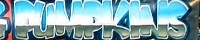
This piece is gonna be great for the Halloween season. The Pumpkin-Soccer Ball blend was a nice challenge. The main thing the coach wanted was to be the SMASHING Pumpkins rather than the SMASHED Pumpkins.
I've wanted to do Chrome Lettering for a while now, and this was a great opportunity. The important design element was to do something which had Blue, to contrast the Orange of the Pumpkin. The problem I've noticed is that the words SMASHING PUMPKINS are a bit hard to read from a distance.
Now, I could have left the letters spread out and not SMASHED them together, and this would have aided in the Distance Legability Factor so important for banners. The -GIVE AND TAKE- of Artistic Merit went towards combining the letters to a unified field, the one the viewer was on, which lead to the day blue sky and the gray green grass in the horizon.
|
|
|
|
|